

Advanced Reporting with Matrix Control in SSRS
Here I will show you how to get these custom aggregates on a matrix report and will cover a few interesting reporting techniques along the way
Cells-by-Cells technique – This helps us achieve a bit more usability with the somewhat limited framework of the SSRS Matrix control by allowing us to add as many subcolumns within a column as we’d like
Custom aggregates – The heart of this article, and probably the very reason you are still reading. Going beyond the standard SUM, we’ll use the powerful inspection expression InScope() to provide nearly limitless calculations.
Custom coloring – We’ll add some data visualization to the report, but we’ll modify the chart coloring at runtime.
Here I had taken Sales of each Item on Year and Monthly basis
Here the Data structure is like
Item Name Year Month Total Sales
Item1 2008 Jan 120
Item2 2008 Jan 150
Item1 2009 Jan 230
Item2 2009 Jan 250
etc..
Here I designed the Cross tab by Year, Month basis for every Item. Add a matrix control to the RDL page and set the Dataset for the Matrix Control. set Column Group and Row group as per the my Previous post.
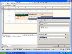
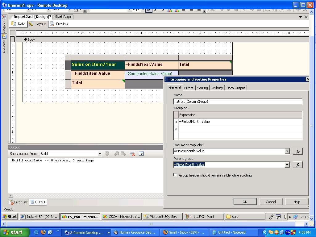
After settting the Row and Column groups, add another Column Group by right clicking on the first row of the Matrix, here set the Month name for the Column Group 2
-- Adding New Column Group
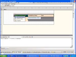
-- Set the Field for Column Group 2
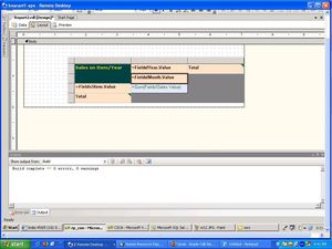
-- The result Matrix will appear like below
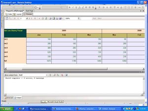
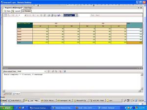
Click on the Preview tab to see the Result, here you will find the Year and month wise report like below, and it will display the Total of the Sales for each Column and Row.
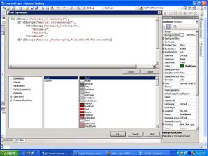
in the Above, the color of Total sales and each individual sales is Same, if we want provide the different color for Column totals, Row totals and Individuals Slaes, her wee need to use Inscope() method to found the each Column and Row then provide the Color as you like.
Select the Data Column, goto the Properties and select the Background Color and set the expression.
then the Output will display in below
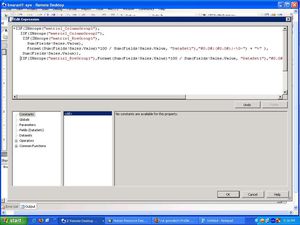
Insetead of Sales total, here by I am Caluclating Avg for the Sales, to caluclate the avg, right click on the Data Column textbox, select the Expression and write your formula to find the Avg in the expression window, here also we should use Inscope() method to find the Total displaying Row, then instead of Total put the formula for Avg,
Formula for Avg :
Format(Sum(Fields!Sales.Value)*100 / Sum(Fields!Sales.Value, "DataSet1"),"#0.0#;(#0.0#);-\0-") + "%" ),
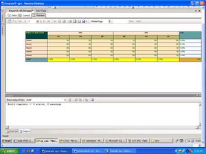
Then the report will appear like.
--
Cells-by-Cells technique – This helps us achieve a bit more usability with the somewhat limited framework of the SSRS Matrix control by allowing us to add as many subcolumns within a column as we’d like
Custom aggregates – The heart of this article, and probably the very reason you are still reading. Going beyond the standard SUM, we’ll use the powerful inspection expression InScope() to provide nearly limitless calculations.
Custom coloring – We’ll add some data visualization to the report, but we’ll modify the chart coloring at runtime.
Here I had taken Sales of each Item on Year and Monthly basis
Here the Data structure is like
Item Name Year Month Total Sales
Item1 2008 Jan 120
Item2 2008 Jan 150
Item1 2009 Jan 230
Item2 2009 Jan 250
etc..
Here I designed the Cross tab by Year, Month basis for every Item. Add a matrix control to the RDL page and set the Dataset for the Matrix Control. set Column Group and Row group as per the my Previous post.
After settting the Row and Column groups, add another Column Group by right clicking on the first row of the Matrix, here set the Month name for the Column Group 2
-- Adding New Column Group
-- Set the Field for Column Group 2
-- The result Matrix will appear like below

Click on the Preview tab to see the Result, here you will find the Year and month wise report like below, and it will display the Total of the Sales for each Column and Row.

in the Above, the color of Total sales and each individual sales is Same, if we want provide the different color for Column totals, Row totals and Individuals Slaes, her wee need to use Inscope() method to found the each Column and Row then provide the Color as you like.
Select the Data Column, goto the Properties and select the Background Color and set the expression.

then the Output will display in below

Insetead of Sales total, here by I am Caluclating Avg for the Sales, to caluclate the avg, right click on the Data Column textbox, select the Expression and write your formula to find the Avg in the expression window, here also we should use Inscope() method to find the Total displaying Row, then instead of Total put the formula for Avg,
Formula for Avg :
Format(Sum(Fields!Sales.Value)*100 / Sum(Fields!Sales.Value, "DataSet1"),"#0.0#;(#0.0#);-\0-") + "%" ),

Then the report will appear like.

--
Share this post


To be informed of the latest articles, subscribe:
/idata%2F2707821%2FSSRS%2Fm1.JPG)
/idata%2F2707821%2FSSRS%2F1.JPG)
/idata%2F2707821%2Fimage_ssrs_arc.jpg)
/https%3A%2F%2Fassets.over-blog.com%2Ft%2Fcedistic%2Fcamera.png)
Comment on this post
N
A
